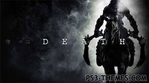
Theme by DemiGod7

Ok, before you jump on me about the icons, there is a reason. I haven’t used any high-res icons like many people, because I wanted this theme to emphasize on “DEATH”. Since this theme is dark, any high-res icons would pretty much ruin the whole thing. Instead, you will see customized standard icons which-in my opinion-fit the theme’s looks better.
The idea behind this project is to make the background and “DEATH” to stand out, I didnt want any bright-coloured high-res icons to ruin that. I hope you agree….if not, let me know below in the comments section! 🙂
The idea behind this project is to make the background and “DEATH” to stand out, I didnt want any bright-coloured high-res icons to ruin that. I hope you agree….if not, let me know below in the comments section! 🙂
PS: This is my second theme about Darksiders II. Im not obsessed with the game or Death, I just want more people to know about this upcoming sequel, which is possibly one of the best releases on 2012.
Download Here

can you do a sd one 2 please
Dont know, you get some kind of error? This theme is HD only, no SD backgrounds used.
this theme doesnt work on my ps3 🙁
@DEMIGOD7: Uh, I understand! Yeah, put in this way, it has its meaning… 😛
Ok, mate, I’ll be waiting for your next theme! 😀
Well uh, the trophy icon is close to the PS Store icon, so I thought about giving it the high-res, so that the PS Store icon does not stand out. Still, many thanks! Im working my way to creating a new theme…..
@DEMIGOD7: I totally agree, and I have to say I really like the overall effect!
I think the only thing that doesn’t fit so much is the trophy icon: I find it’s completely in contrast with the intentional effect of “decadence” that you gave to the theme…
But it’s just my opinion, of course 😉
Anyway, you did a good job, mate! 😀
Yeah well, it’s not always about making bad-ass icons, but also matching the icons with the theme’s style. Appreciate the good feedback and also im glad you downloaded my theme and liked it!
And I can pretty much see where the resemblance with Skyrim is conimg from, having played the game….. 😉
Looks pretty good.
Not everything needs to have bright/colorful icons that stand out either.
It has more to do with the backgrounds you plan to use, so good call imo.
Also on a unrelated note, that picture really reminds me of one for Skyrim, almost to possible lawsuit levels lol.