Get a top repair fireplace peoria that’s now available and at good rates now only!
Get a top divorce lawyers bozeman currently now available in addition at good rates now only!
Hire the best wood stove repair peoria that is now available in addition with reasonably pricing now only!
Its a great theme that you made Jay
me gusto 😀
Much Appreciated 🙂
mr_foxx, I know its asking too much but could you change the sounds. They are a bit annoying.
i want the system its self to work again, the system is very sentimental to me because me and my bestfriend played it alot before he died, theres even a dimple that got burned in next to the power button from when we wher smoking a joint together and i sat the doob on the console for a few seconds, probably to finish kicking somethings ass all over nintendo land, lol. anyways..
that little red light hasnt been switched on for what seems like15 years or so. and i think its time to fire it up*
Download the emulator and the N64 games for free. Aaaarrrgghh me matey, LOL
my tv remote just stopped working on thanksgiving , i guess when it rains it pours, i heard that if you get a game shark for n64 doom has a code for a ‘high res’ mode, i wonder what thats about? but it sounds worth it, lol, on the gameshark 3.3 there is a connection on the back for connecting to a computer for hacks, i can conect my 64 to a computer and download crazy stuff aparently, like updated stuff from 2010 on a gameshark? lol.
this could be interesting! 🙂
i saw a 64DD conecter and heard it was discontinued in japan due to piracy, basterds, could have done so mutch with a 64 disk drive if developers found a way to block sertin things and evolve others, but i guess the gameshark 3.3 will hafto do.
used n64 games are like $8, lol im gonna build a library! im gonna get a Snes as well. thank you for the responses fellas! i never went anywhere optimus, still here.
@Doom: Hey, my friend… glad to hear you again! 😀
As for me, well, I have to say the old games are not that bad on a HD TV: I keep on playing them all – 8/16/32/64/128 bit – and I can say they’re not bad at all.
Sure, they obviously would look a bit better on a CRT TV (since that’s the era to which they belong) but on a HD TV, their graphics isn’t worse than it was in the past, after all… and if you set the TV screen to 4:3 format with the noise reduction on, then everything gets better. 😉
@doom> it’s gonna look like shit on a HD TV compared to PS3/XBOX, but not nearly as bad as a PS1 game. You can fix the aspect ratio of your TV so the picture isn’t stretched. You’ll have black bars on both sides. If you’re not a graphics whore then it’s not too bad 🙂
+1, mr snake pliskin is one of my all time favorite badass characters. i couldn’t get into the one where he dies for the simple fact that he dies, that kinda pissed me off.
ive been feeling like getting into retro games really bad lately, nintendo64, gameCube, ps2,
but i have been tormented with the thought that older games are gonna look like shit on my 32′ Lcd..
back in highschool in 1997 me and my bestfriend blasted koRn and played the shit out of doom64 untill he passed away in 98,
over the years pieces ans wires have been striped from the console down to the jumper pack being stolen,, it has been chopped,,
its been sitting atop my beer fridge next to his ps1 for years, then i found out the original guitarist from koRn recently rejoined the band and they made a come back album that rocks as hard as thir old shit, …so
i bought the super pad pluss controller that has a more modern shape and a beefed up joystick, expantion pac for a faster frame rate to replace the jumper pac, memory card, wires. and doom64. set me back like $125 after i stopped at a music store to pick up 2 new cds. i was like F*** YEAH! TIME TO SMASH SOME DEMON FACES UAC STYLE!!
so everything is being delivered to my house within 7 days and i recently was staring at my tv n was like fuuuuudge,,, is my screen gonna stretch the picture like silly puddy? what is a 64bit console going to look like on n Lcd tv? better yet a 16bit console. i plan on digging into retro nintendo from SNES to GameCube.
has anyone tryed anything like this with a Lcd tv?
Looks nice! These Icons are much better!
@Wade Wilson: You got the wrong guy, but you’re welcome! Glad it helped out! I messed around and gleaned information from various sources to figure sounds out, so I wanted them in one place so everyone else wouldn’t have to do the same thing!
I am digging the new icons much more, great job there.
Unfortunately, I only gave my +1 🙁 😉
Thanks mr_foxx for completing my request, I love this theme.
Also thanks to ultra for giving you the idea.
I thank everyone who was involved in making ths theme. 🙂
@mr_foxx: I liked the theme, despite the icons 😛 but with the new ones, it really is much better… +1! 😀
@uLtRaMa6nEt1c thanks for the tip man
@Wade Wilson wait whah i didnt do any tutorials on sounds not that i remember lol
Mr_Foxx – I wanted to thank you for your tutorial on sounds. I used the information today regarding such. I was having problems until I read it .
–
Cheers Mate
That is much better. Awesome +1 🙂
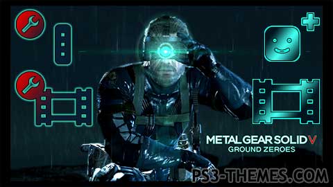
i have updated the icons for this theme i hope you guys like these better i just uploaded the so its coming soon… checkout the preview video here..https://www.youtube.com/watch?v=DRtT8z3XwAw
@mr_foxx> you know, the little sub-icon that’s a circle with the wrench in it. It’s also on all the settings icons except the update icon.
@uLtRaMa6nEt1c ok im gonna do a update on the icons but what settings wrench icon are you talking about?
*A darker color like his gloves would match better with the aqua*
That’s cool. The cursor sound can get annoying quick. I like the other sounds. I see the red ‘V’ in the logo, but there’s too much red in the icons. That makes it look like it doesn’t match. A darker color like his gloves would go better the the aqua. Use the red for the settings wrench icon since it’s about as visible as the ‘V’. Aside from those 2 things, nice job +1 🙂
i would like to know why you think the icons dont belong with this theme?
I will agree about the icons. Although well made, they don’t really fit in this theme.
That being said, everything else is very nice, dynamic elements and sounds are well made and fitting!
Nice theme but I don’t think the icons go with this theme.
Get a top repair fireplace peoria that’s now available and at good rates now only!
Get a top divorce lawyers bozeman currently now available in addition at good rates now only!
Hire the best wood stove repair peoria that is now available in addition with reasonably pricing now only!
Its a great theme that you made Jay
me gusto 😀
Much Appreciated 🙂
mr_foxx, I know its asking too much but could you change the sounds. They are a bit annoying.
i want the system its self to work again, the system is very sentimental to me because me and my bestfriend played it alot before he died, theres even a dimple that got burned in next to the power button from when we wher smoking a joint together and i sat the doob on the console for a few seconds, probably to finish kicking somethings ass all over nintendo land, lol. anyways..
that little red light hasnt been switched on for what seems like15 years or so. and i think its time to fire it up*
I just visit CoolROM for N64 games and I bought one of these:
http://www.meritline.com/n64-usb-wired-controller-for-pc-mac-rb-n64-861—p-106945.aspx?source=fghdac&gclid=CIr6oLTQlLsCFYFhMgod7QkAmw
ill respond to that after work,
Download the emulator and the N64 games for free. Aaaarrrgghh me matey, LOL
my tv remote just stopped working on thanksgiving , i guess when it rains it pours, i heard that if you get a game shark for n64 doom has a code for a ‘high res’ mode, i wonder what thats about? but it sounds worth it, lol, on the gameshark 3.3 there is a connection on the back for connecting to a computer for hacks, i can conect my 64 to a computer and download crazy stuff aparently, like updated stuff from 2010 on a gameshark? lol.
this could be interesting! 🙂
i saw a 64DD conecter and heard it was discontinued in japan due to piracy, basterds, could have done so mutch with a 64 disk drive if developers found a way to block sertin things and evolve others, but i guess the gameshark 3.3 will hafto do.
used n64 games are like $8, lol im gonna build a library! im gonna get a Snes as well. thank you for the responses fellas! i never went anywhere optimus, still here.
@Doom: Hey, my friend… glad to hear you again! 😀
As for me, well, I have to say the old games are not that bad on a HD TV: I keep on playing them all – 8/16/32/64/128 bit – and I can say they’re not bad at all.
Sure, they obviously would look a bit better on a CRT TV (since that’s the era to which they belong) but on a HD TV, their graphics isn’t worse than it was in the past, after all… and if you set the TV screen to 4:3 format with the noise reduction on, then everything gets better. 😉
@doom> it’s gonna look like shit on a HD TV compared to PS3/XBOX, but not nearly as bad as a PS1 game. You can fix the aspect ratio of your TV so the picture isn’t stretched. You’ll have black bars on both sides. If you’re not a graphics whore then it’s not too bad 🙂
+1, mr snake pliskin is one of my all time favorite badass characters. i couldn’t get into the one where he dies for the simple fact that he dies, that kinda pissed me off.
ive been feeling like getting into retro games really bad lately, nintendo64, gameCube, ps2,
but i have been tormented with the thought that older games are gonna look like shit on my 32′ Lcd..
back in highschool in 1997 me and my bestfriend blasted koRn and played the shit out of doom64 untill he passed away in 98,
over the years pieces ans wires have been striped from the console down to the jumper pack being stolen,, it has been chopped,,
its been sitting atop my beer fridge next to his ps1 for years, then i found out the original guitarist from koRn recently rejoined the band and they made a come back album that rocks as hard as thir old shit, …so
i bought the super pad pluss controller that has a more modern shape and a beefed up joystick, expantion pac for a faster frame rate to replace the jumper pac, memory card, wires. and doom64. set me back like $125 after i stopped at a music store to pick up 2 new cds. i was like F*** YEAH! TIME TO SMASH SOME DEMON FACES UAC STYLE!!
so everything is being delivered to my house within 7 days and i recently was staring at my tv n was like fuuuuudge,,, is my screen gonna stretch the picture like silly puddy? what is a 64bit console going to look like on n Lcd tv? better yet a 16bit console. i plan on digging into retro nintendo from SNES to GameCube.
has anyone tryed anything like this with a Lcd tv?
Looks nice! These Icons are much better!
@Wade Wilson: You got the wrong guy, but you’re welcome! Glad it helped out! I messed around and gleaned information from various sources to figure sounds out, so I wanted them in one place so everyone else wouldn’t have to do the same thing!
I am digging the new icons much more, great job there.
Unfortunately, I only gave my +1 🙁 😉
Thanks mr_foxx for completing my request, I love this theme.
Also thanks to ultra for giving you the idea.
I thank everyone who was involved in making ths theme. 🙂
@mr_foxx: I liked the theme, despite the icons 😛 but with the new ones, it really is much better… +1! 😀
@uLtRaMa6nEt1c thanks for the tip man
@Wade Wilson wait whah i didnt do any tutorials on sounds not that i remember lol
Mr_Foxx – I wanted to thank you for your tutorial on sounds. I used the information today regarding such. I was having problems until I read it .
–
Cheers Mate
That is much better. Awesome +1 🙂
i have updated the icons for this theme i hope you guys like these better i just uploaded the so its coming soon… checkout the preview video here..https://www.youtube.com/watch?v=DRtT8z3XwAw
@mr_foxx> you know, the little sub-icon that’s a circle with the wrench in it. It’s also on all the settings icons except the update icon.
@uLtRaMa6nEt1c ok im gonna do a update on the icons but what settings wrench icon are you talking about?
*A darker color like his gloves would match better with the aqua*
That’s cool. The cursor sound can get annoying quick. I like the other sounds. I see the red ‘V’ in the logo, but there’s too much red in the icons. That makes it look like it doesn’t match. A darker color like his gloves would go better the the aqua. Use the red for the settings wrench icon since it’s about as visible as the ‘V’. Aside from those 2 things, nice job +1 🙂
i would like to know why you think the icons dont belong with this theme?
I will agree about the icons. Although well made, they don’t really fit in this theme.
That being said, everything else is very nice, dynamic elements and sounds are well made and fitting!
Nice theme but I don’t think the icons go with this theme.